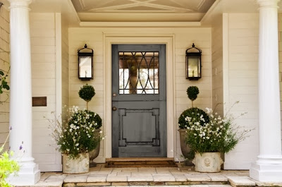
This week I've been researching Dutch door hardware for a particular project. I wanted to get the look and the functionality just right. One of the dilemmas was where to put the hardware. Most commonly the hardware is on the bottom panel, and I think this is the nicer look. However this sometimes means that the knob is much lower than a standard door knob height. Which way would you go; better looking or easier to use?
I love the look of the Dutch door where the top half of the door is glass. This Dutch door softens the look of the formal entry foyer above.
It also adds a human element, and some movement to a potentially static environment.
I love these high gloss black doors. I also love the framed maps beyond!
This door has an interesting pattern...Love the porch, the urns, and the riding boots!
The Dutch door makes this formal 6 panel door unique. Note the interesting hardware...it's in the center of the panel??
This Dutch door looks right on this pretty country house...great color, love the old bluestone landing and path! Old New England!
High gloss blue with the vibrant yellow...so sophisticated.
This looks like an old Victorian updated with modern furnishings. Love!
This is such an interesting door. The upper panel looks like an art frame. That's all you need with a view like this.
One of my favorite entry foyers. Love the door, the hardware, the windows, the paneling...It all feels exactly right.
A unique and decorative door...especially pretty upper portion. Beautiful lights, lovely porch.
This mudroom looks perfect with a Dutch door.


.jpg)


