Wednesday, December 23, 2009

Holiday House Tour


Our house was recently part of a Holiday House Tour as a fundraiser for a local church.  Our interiors are inspired by the colors in our artwork, mostly watercolor paintings done by my mother Adele Huestis.  The holiday decoratations are in turn inspired by the colors of the rooms.  With the assistance of my friend, Events Planner Fran Morrow, I decorated the house with lots of fresh greens, and family ornaments, and a few borrowed items. 


Our Entry hall is extremely small, but gets lots of sunlight.  We have made it into a mini conservatory, where we store all of our geraniums for the winter.  We also love to force bulbs for the winter.


My friend Jeanne Ciravolo did the oil painting above the mantel.  She is an incredibly talented portrait artist.  You can see more of her paintings on her website http://www.ciravolo.com/


Here is an upclose shot of one of my mom's paintings. I love having her paintings in my home.  I wish she had a website, but alas she does not.  If you want to inquire about her work, you can contact me.


This room was recenlty painted using Ben Moore's Pale Smoke.  I am so pleased with the color. This room faces north and doesn't get much daylight compared to some of our other rooms.  So this gray blue really had to hold it's own, and I think it does.


Thursday, December 3, 2009

The Holiday Spirit


Is there a better way to get in the Holiday Spirit than to go shopping? I like to go to my favorite antique and home stores to get inspired to start decorating for the Holidays.

One of my favorite places to go is Pickets in Fairfield, Ct. I have been stopping in frequently lately because I am working on a project nearby. The owner, Laura Baker, couldn’t be nicer and she has great taste! She mixes beautiful antiques and new pieces with garden inspired accessories.


Another of my favorite places is Seymour Antiques in Seymour Ct. They always have really creative displays. The owner combines fine antiques with rustic pieces, always to good effect.
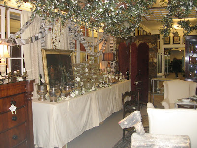


I also stopped into ABC home and Carpet in New York recently. It was a little overwhelming because they had so many fantastic things to look at.


Friday, November 20, 2009

My Favorite Room

If I had a butler's pantry, I believe it would be my favorite room.  I recently visited a completed project of ours where we designed, among other rooms, a new Butler's Pantry.   It got me thinking about why a room, in which one woudn't spend very much time, would be so desired and so often asked for by our clients.  Two reasons come to mind.  

The first is that most of us are craving a more organized life and by extension, a more organized home. A little room filled with storage cabinets, in which all of one's china, stemware, linens, and silverware can be neatly and beautifully organized, epitomizes the ideal of an organized home. 

I think the other reason a Butler's Pantry appeals to so many people is that at it's very basic level it signifies having and sharing abundance.  And that if you have stacks of dishes and rows of glassware, you would have the ability to graciously entertain your family and friends, thereby sharing the abundance you have with your loved ones.


This butler's pantry by McKim Mead and White is to me the quintessential Butler's Pantry.  The tall ceilings and endless cabinets and shelving are fabulous. The integration of cabinetry and paneling is seamless.  Of course this is a huge room, definitely big enough to be a modern kitchen.


This is a Butler's Pantry which was recently completed.  We made the arched opening really large so it would feel like an extension of the Dining Room.  The owners wanted to be able to entertain in both spaces.  We didn't have high ceilings to work with, but we wanted to integrate the cabinets and paneling.


We often install mirrors in the paneling at the backsplash to add a little sparkle to the Butler's Pantries which double as wet bars. Below we made the best of a really small passage between a Kitchen and a Dining Room.


This red Butler's Pantry is a counterpoint to a white kitchen.  The cabinet at the far end of the room houses stereo equipment and is on wheels for easy access to the power cords.


This is a Kitchen we designed to have the feel of an old Butler's Pantry.  We put the cabinets right up to the 10' ceilings.  We used the old fashioned latches, glass cabinets, wood brackets, and a beaded board ceiling to help create the feeling of another era.